You may have noticed something slightly different about our beloved, ubiquitous circular logo that includes the house icon and our name. No, isn’t new attic insulation or a fresh air seal, although we do always recommend a retrofit whenever possible. However, it did receive a fresh coat of paint--and a new set of solar panels.
What’s Changed?
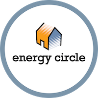
If you need a little refresher, here is what our old logo looked like:

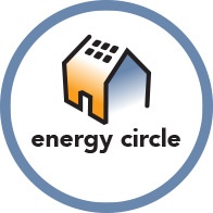
And here is what the new logo looks like:

It’s like one of those “find the difference” games, isn’t it? Well, if you want to locate the updates within the logo on your own, skip this next section!
If you’re curious about the why as well as the what of these changes, you’re in luck. Brand identity work takes many factors into consideration, and there were several key components of the logo evolution that we wanted to ensure we took into consideration as we updated the look of Energy Circle’s most prominent visual asset.
Gradient Shading
One subtle change of the Energy Circle house icon—fondly known as our "hot and cold house"—is the move from a stippled coloring to a more streamlined gradient. The colors of the house represent heating and cooling, and are indicative of both the duality of the industries in which we work and the services they provide (for example: air conditioning and heating), as well as the cycles necessary in whole house system. With a refined, fresh feel, this gradient change is a simple one that represents a more modern aesthetic choice.
Sans Serif Logotype
Another simple, yet impactful change to how the new logo feels is the change from the previous serif font to a sans serif font. In other words, the font that had small “feet,” or lines jutting off of the letters, was smoothed out, made more curvilinear, with cleaner lines and no small protrusions (think the logos for Apple, Google, and other tech giants). The modernization of this aspect of the logo—along with the updated gradient shading of the house logo itself—represents the need for evolution and agility within digital marketing. The world in which Energy Circle works is perpetually progressing and updating, with new practices and industry standards emerging every day—on both the marketing side, and in the home performance, HVAC, and solar industries. We want to make sure that we continue to position ourselves as up-to-date and on the cusp of every emerging trend, so that we can provide the most relevant information and best practices possible to our clients. Sleek imagery and a modern logotype is a cue conveying our ability to do so.
Solar Panels
The easiest-to-spot change on the new Energy Circle logo is the addition of the small, graphic squares representing solar panels on the roof of the house icon. This addition is foremost a nod to the important rise of solar contracting in the sectors that we represent. However, it is also an indication of the need for innovation and meeting the needs of the changing world around us. Sustainable practices continue to gain traction as a fundamental alternative to traditional or fossil fuel-based energy resources. Renewables are no longer an outlier, but a natural inclusion in the array of home energy options, and the small addition to our logo icon is in tribute to that.
Your Logo is an Asset
So what can your business take away from our logo updates? An understanding that your logo is an asset. It is your business card, the sign on your building, and the watermark on all of your promotional materials. And as the millennial generation becomes a more prominent customer for our industries, your first impression is integral to capturing the brand loyalty of these “children of the baby boomers”. According to a 2015 study from CSCanada: “ Millenials don’t look at a large, established organization and think “ I wonder where I’ll fit in your complex picture.” Rather they look at an employer and think, “I wonder where you will fit in my life story” (Tulgan, 2009)”
A growing number of your potential clients are looking at your logo, and determining if it reflects their beliefs and values.
An Evolving World
The updates to the Energy Circle logo are pretty to look at, sure, (just take another moment to appreciate that gradient color scheme again!) but they are also symbolic of the innovation within the industry that we represent, and our clients within that industry. Remaining current with industry best practices and new technologies in the home performance, HVAC, and solar industries is equally as important as remaining on the cutting edge of SEO and changes to Google’s platforms. Our logo is also a visual cue and a reminder of our daily dedication to providing the most impactful and cutting edge digital marketing services for our clients as possible—with the utmost understanding of their services and competitive landscape.